Conversion-focused structure
Every section earns its place. Headline, value proposition, proof, offer and CTA arranged in the order a visitor actually reads. No filler, no distraction .
You can send all the traffic you want. If the page does not make the next step obvious, it is wasted spend. We design landing pages with one job in mind: turning visitors into leads, signups or sales. Clear messaging, focused layouts and CTAs people actually click.
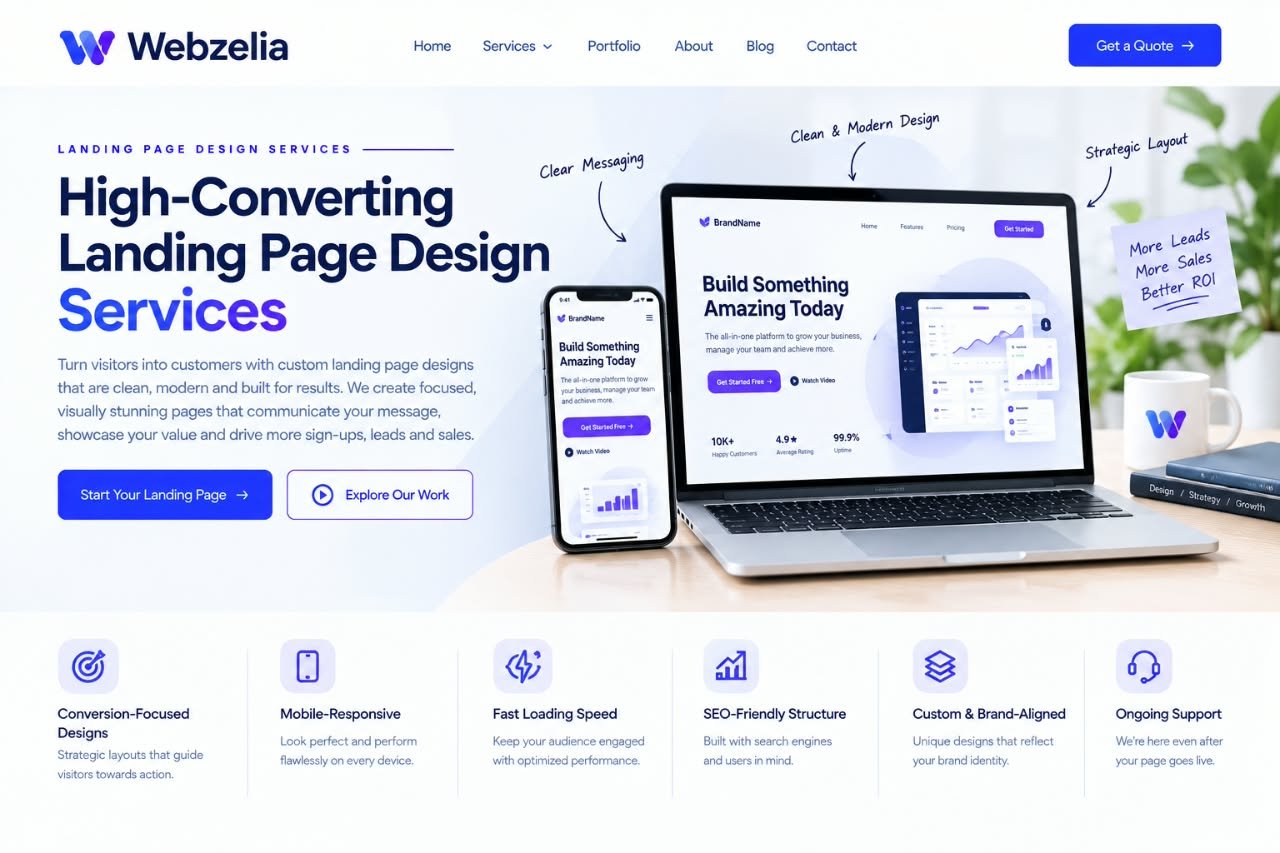
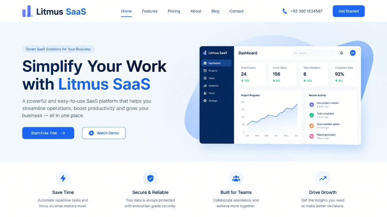
You spend money to get someone to click. They arrive on your page. In the next few seconds, they decide whether to scroll, read or leave. If the headline is vague, the value is unclear, or the next step is buried, they are gone. Not because your offer is bad. Because the page did not do its job.
Landing pages are not smaller versions of your website. They are single-purpose tools. No navigation to wander off to. No competing messages. One problem, one solution, one action. That focus is what separates pages that convert from pages that look nice and quietly waste money.
Every section earns its place. Headline, value proposition, proof, offer and CTA arranged in the order a visitor actually reads. No filler, no distraction .
The page speaks the same language as the ad, email or post that brought the visitor there. Continuity builds trust and reduces the chance of them bouncing .
Most paid traffic arrives on phones. We design the mobile experience first, then scale up. If it does not work on a small screen, it does not work.
Testimonials, logos, numbers and guarantees placed where hesitation happens. Evidence at the right moment does more than persuasion in the wrong one.
One primary action, repeated at natural decision points. The button says what happens next. The form asks for the minimum. The path forward is obvious.
For campaigns with traffic to spare, we design variations of headlines, offers and CTAs, then set up testing so decisions come from data, not opinion .
Every engagement starts with a short call about your offer, audience and traffic source. We recommend the scope that fits, whether that is a single page or a full campaign system.
| Single page | Campaign set | Conversion program | |
|---|---|---|---|
| Best for | One offer, one audience | Multiple offers or segments | Ongoing testing and optimization |
| Pages designed | One landing page | Two to four pages | Continuous |
| Copywriting | Optional add-on | Included | Included with revisions |
| Design variations | One layout | Two headline or CTA variations | Multiple, tested over time |
| A/B testing setup | Not included | Basic setup | Full testing and reporting |
| Reporting | Delivery handoff | Post-launch performance review | Monthly optimization report |
| Homepage as landing page | Template landing page | Webzelia landing page | |
|---|---|---|---|
| Focus | Many messages competing | Generic structure | One goal, one clear action |
| Message match | Rarely aligned with ads | Not considered | Matched to the traffic source |
| Mobile experience | Often an afterthought | Shrinks awkwardly | Designed mobile-first |
| Trust signals | Scattered or missing | Generic icons | Placed at decision points |
| Improvement over time | Rarely tested | Not tested | A/B testing where traffic allows |
Google Ads, Meta and LinkedIn campaigns that need a page aligned with the ad, not a generic homepage.
New offers that need a focused page to explain the value, build interest and capture signups.
Pages designed around a single conversion: form fill, demo request, download or consultation booking.
Pages that get traffic but not conversions, where the problem is structure and messaging, not the offer itself.
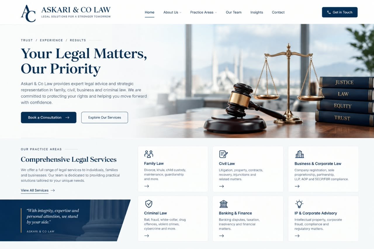
A focused consultation page that converted ad traffic into qualified legal enquiries.
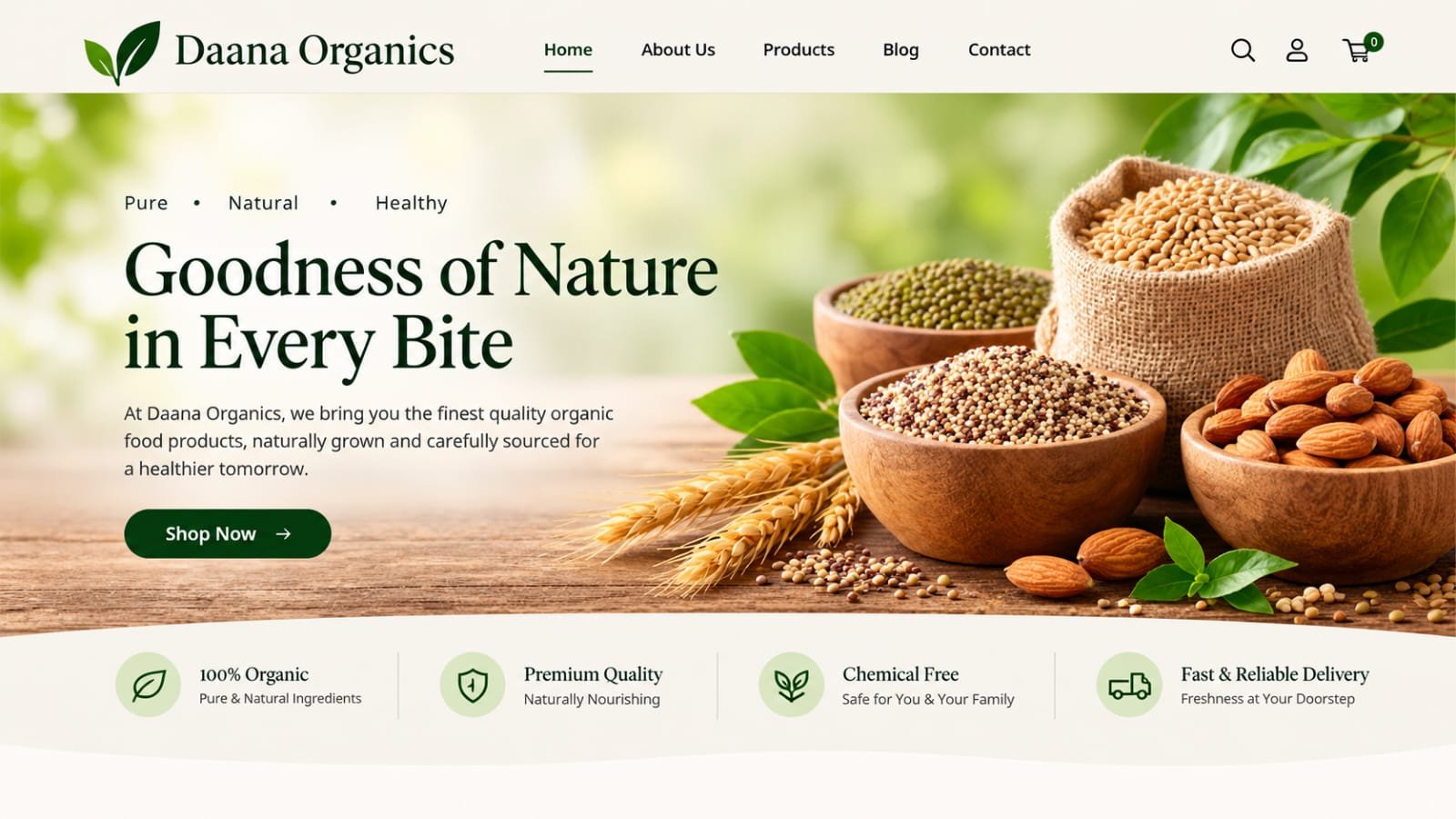
A product landing page that matched the ad message and lifted add-to-cart rates.
A demo request page that aligned with LinkedIn campaigns and improved lead quality.
We talk about your offer, audience and traffic source. What action should the visitor take? What objections need answering? What proof do you have? The page is planned before it is designed.
We map the page section by section: headline, value, proof, offer, CTA. The wireframe confirms the logic before any visual design starts.
High-fidelity design with messaging written for the page. Mobile first, responsive, and built to match your brand without getting in the way of conversion.
Developer-ready files, conversion tracking guidance, and a post-launch review of how the page performs. If traffic allows, we set up testing for the next iteration.
We were sending ad traffic to our homepage and wondering why nothing converted. The landing page they built changed that completely. Same budget, triple the leads.

The page matched our ad exactly. Visitors stopped feeling like they had landed somewhere else. That continuity alone made a visible difference in form completions.

They rewrote the messaging and restructured the page. Our cost per lead dropped by almost half in the first month. The design was good, but the strategy behind it was better.

A landing page is a standalone page designed for a single goal: converting visitors into leads or customers. Unlike a general website page, it removes distractions, focuses on one message and drives one clear action. It is where ad clicks, email traffic and campaign visitors go when you want them to do something specific.
A regular website page serves many purposes: informing, browsing, exploring. A landing page has one job. It usually has no main navigation, one primary call to action, and messaging tightly matched to the traffic source that brought the visitor there. That focus is what makes it convert.
It depends on complexity and whether you need copywriting, multiple variations or A/B testing setup. We provide a fixed quote after a short call. Most projects fall into a predictable range, and we will tell you honestly if a landing page is not the right investment for your situation.
We can do both. Landing pages live or die on messaging, so we prefer to be involved in the copy. If you have a copywriter, we will work with them. If not, we write it as part of the project.
A single focused landing page usually takes 1 to 2 weeks from kickoff to delivery, depending on feedback cycles. Campaigns with multiple pages or A/B test variations take longer. We agree on a timeline before starting.
Yes, and mobile is designed first. Most paid traffic comes from mobile devices, so we design the mobile experience before the desktop version. A landing page that looks good on desktop but breaks on mobile will fail at the exact moment it matters most.
We can. For campaigns with meaningful traffic, we design multiple headline or CTA variations and set up testing through your analytics or testing tools. A/B testing only makes sense with enough traffic to reach statistical confidence, and we will tell you if you have it.
Yes. This is one of the most common requests we get. We audit the existing page, identify where it is losing visitors, and rebuild it around clearer messaging, stronger hierarchy and a more focused conversion path.
Fill out the form or reach us directly. We read every message ourselves and reply within one business day, usually with a free review of your current landing page or traffic source.
Tell us about your campaign and where the traffic goes. We will send an honest landing page review within one business day, showing where visitors are dropping off and what to fix first.
Webzelia is a web development and social media marketing agency, building websites, web apps and growth campaigns for businesses across the world. Find out countries we serve.